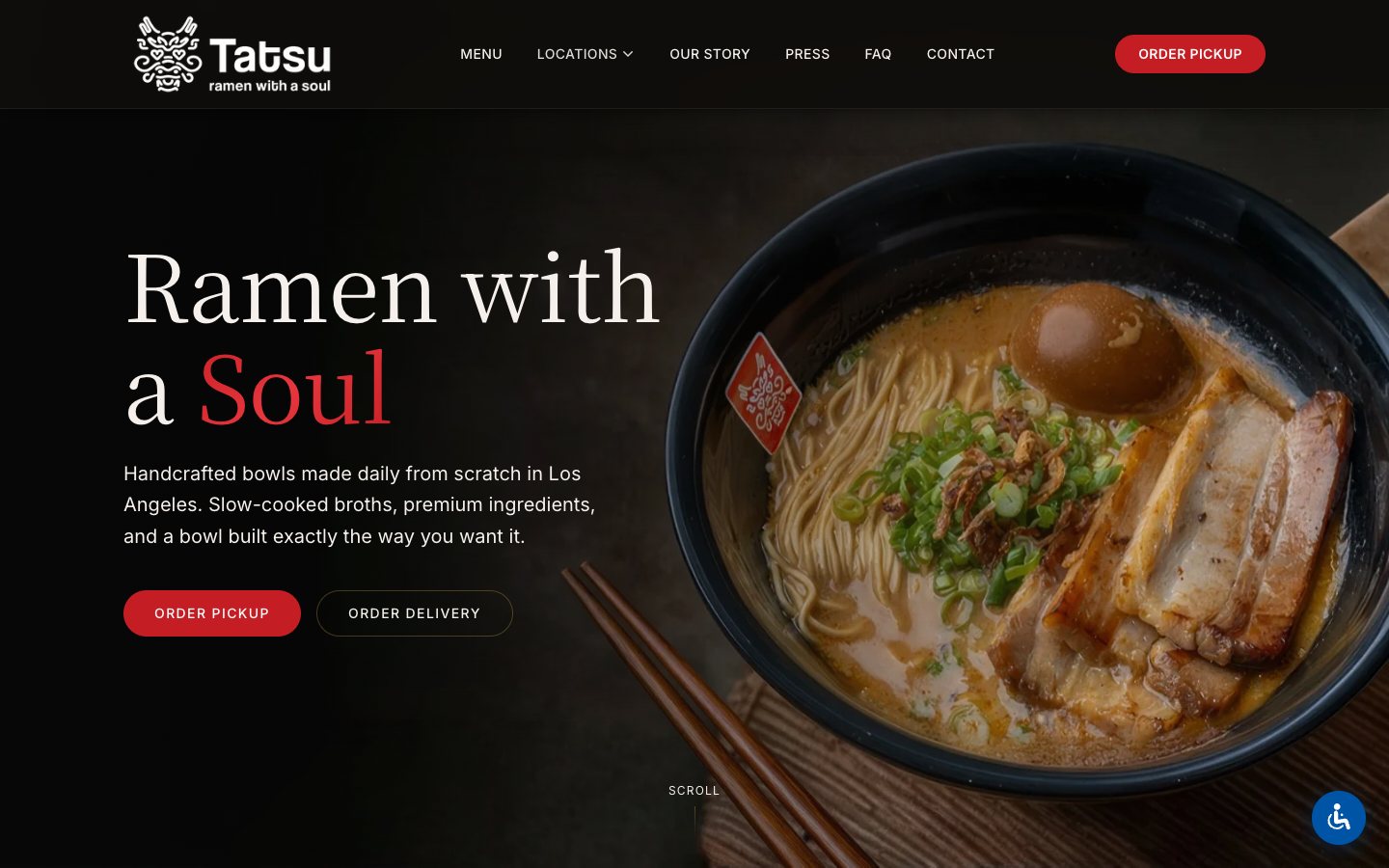
Built by Pine
Back to selected work

Featured case study

A faster, more brand-true digital home for Tatsu Ramen.

Tatsu did not need a prettier restaurant template. It needed a site that felt unmistakably Tatsu, guided people to the right location fast, and held up on the phones where dinner decisions actually happen.

Restaurant brand Multi-location structure Mobile-first UX Launch review included
Client
Tatsu Ramen
Scope
Website design + development
Timeline
7-day sprint
Focus
Brand feel, mobile speed, location clarity

This page stays close to the build decisions and launch proof we can stand behind publicly. Where business impact is not verifiable, we do not invent it.

7 days

Design to launch

95

Mobile PageSpeed at launch

100/100

SEO and accessibility checks at launch

Multi-location

Restaurant architecture

01

What the site needed to do.

The brief was not just "make it look better." Tatsu already had a strong brand. The website needed to translate that energy into a clearer digital experience for first-time visitors and returning customers alike.

  • Feel unmistakably Tatsu from the first screen, not like a generic restaurant template.
  • Make menu, location, and ordering paths easier to reach on mobile.
  • Support a multi-location brand without turning the site into a directory.
  • Launch quickly without sacrificing performance or automated accessibility checks.
Tatsu Ramen website homepage shown inside a browser window

The redesign centered the site around appetite, navigation clarity, and a more confident brand tone so the experience felt closer to the in-person restaurant.

02

What changed in the build.

We kept the strategy tight: express the brand more clearly, shorten the mobile decision path, and protect the launch baseline instead of chasing those fixes after go-live.

Lead with the feeling

The first screen had to feel unmistakably Tatsu: dark, cinematic, confident, and built around the food instead of generic restaurant tropes.

Make mobile decisions easier

We structured the site so a hungry visitor could move from homepage to bowls, locations, and ordering without friction on a phone.

Protect the launch baseline

Performance, SEO, and automated accessibility checks were treated as launch requirements, not cleanup work for later.

Tatsu Ramen story page with brand photography and editorial layout
Tatsu Ramen menu page with food photography and categorized items
Tatsu Ramen locations page with map and restaurant locations

03

Launch review, scoped honestly.

We kept the proof close to the build: a launch-time snapshot of mobile performance, search checks, and automated accessibility review rather than broad claims we could not support.

541ms

Largest Contentful Paint

541ms

First Contentful Paint

0

Cumulative Layout Shift

329ms

Total Blocking Time

100/100

Lighthouse SEO

100/100

Automated accessibility checks

Snapshot captured during launch review in April 2026 using mobile Google PageSpeed Insights, GTmetrix, and automated accessibility scans. These figures describe launch conditions, not a guarantee of future scores or legal compliance.

04

A tighter screen story.

Once the architecture was right, the screens had a clearer job: brand first, decision-making second, clutter removed.

Tatsu Ramen homepage mid-section with moody photography and story-led brand content
Featured screen

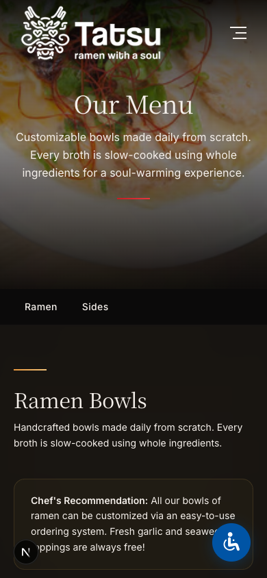
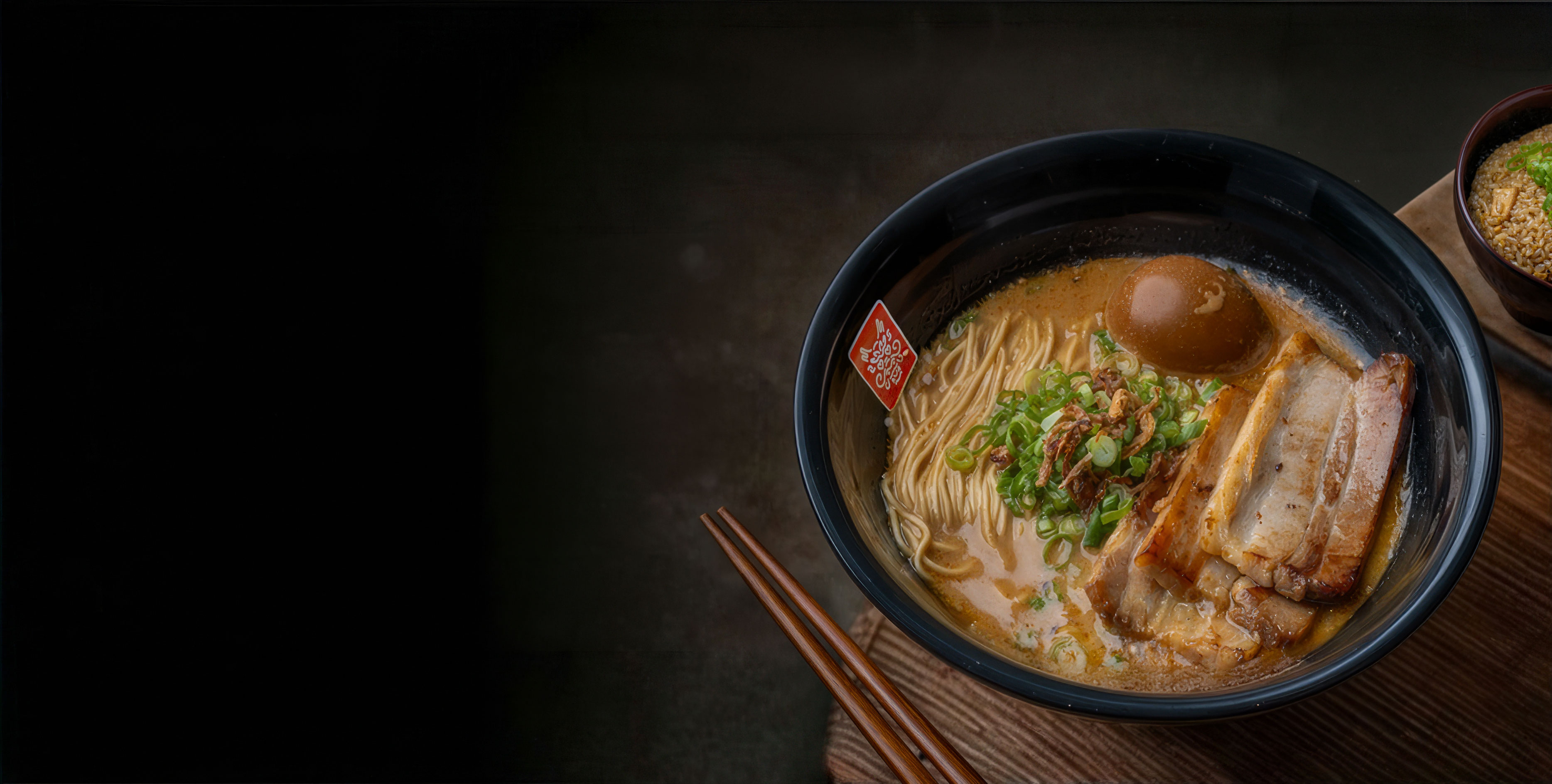
A homepage with more appetite and more intent

The homepage moved from being a generic restaurant entry point to a stronger first impression with clearer hierarchy and richer brand cues.

This screen carries the job the old layout was missing: introduce the brand with more appetite, then move a visitor toward the right next action without making the homepage feel crowded.

Tatsu Ramen menu page with ramen categories and food-led imagery

Menu pages built for appetite and clarity

The menu experience keeps the food doing the persuasion while still making categories, pricing, and decisions easy to scan.

Tatsu Ramen locations page with a map and restaurant details

Location discovery without clutter

Multi-location structure was treated as part of the core UX, not buried in the footer or left to a generic directory page.

Tatsu Ramen mobile menu browsing experience

Mobile-first, not mobile-afterthought

Key flows were shaped for the device where restaurant decisions usually happen, with simpler tap targets and faster visual loading.

05

Why this project matters.

The outcome was not just a nicer restaurant site. It was a clearer digital front door: more brand confidence on the first screen, less friction in the mobile path, and a stronger foundation for future menu, location, and content updates.

  • A website that feels closer to the in-person brand experience on the first screen.
  • A clearer path from landing page to menu, location, and ordering on mobile.
  • A launch-ready baseline for performance, search visibility, and automated accessibility review.

If you run a restaurant or local brand where first impressions matter, this is the standard we aim for: clearer positioning, stronger design intent, and proof you can discuss without hand-waving.

Want the same level of clarity for your brand?

We design websites for brands that care how the first impression feels and how easily a visitor can act on it.

Start the conversation