Back to selected work
Selected work
Mobile-first ordering for Gud2Go.
Gud2Go is a grab-and-go cafe. The site needed to make ordering on a phone feel effortless — fast first paint, an obvious next step, and a brand that still reads clearly at thumb-tap scale.
Cafe Mobile-first UX Ordering-first Decision clarity
- Client
- Gud2Go
- Scope
- Ordering-first website
- Category
- Cafe
- Focus
- Mobile UX, ordering path, decision clarity
We don't invent numbers. This page describes the design and build decisions we can stand behind publicly, not metrics we can't verify for this client.
01
What the site needed to do.
A grab-and-go cafe is a different design problem than a sit-down restaurant. Visitors decide quickly, often on a phone, often in line or on the move. The site had to match that pace.
- Make the mobile path from homepage to order obvious in one tap, not three.
- Match the grab-and-go pace with no splash screens and no slow third-party widgets.
- Keep the brand legible at thumb-tap scale so menu and price still read on a small screen.
- Avoid clutter that distracts a visitor who is walking, in line, or already on the way.
02
How we worked on it.
The brief was simple, the discipline was the hard part: keep the homepage from drifting into "all-the-things-a-cafe-could-show" and protect the order path from being buried.
Treat mobile as the primary canvas
Layout and tap-target decisions were made at phone scale first, then scaled up to desktop. The site was not a desktop design squeezed onto a phone.
Move ordering above every other decision
The primary CTA is the order action. Reservation, contact, and hours sit below the fold so a visitor never has to hunt for the thing they came for.
Strip non-essential weight
No hero video, no third-party widgets blocking first paint, no PDF menus. The page loads, the menu reads, and the order button works on a slow signal.
03
What changed for the customer path.
The outcome was a cleaner path from homepage to menu, with less friction for busy on-the-go visitors. Mobile-first UX and a simplified ordering path mean a first-time guest can decide and act without digging through a menu PDF or a slow third-party booking widget.
- A homepage where the order action is the first thing a visitor can see and tap.
- A faster, lighter mobile experience without third-party widgets sitting on first paint.
- A brand that still reads at small sizes — type, contrast, and spacing tuned for thumb-scale browsing.
We're not publishing conversion or revenue figures for this project. The wins we'll stand behind are design wins: a clearer mobile path, a faster first paint, and a homepage where the order action isn't competing for attention.
04
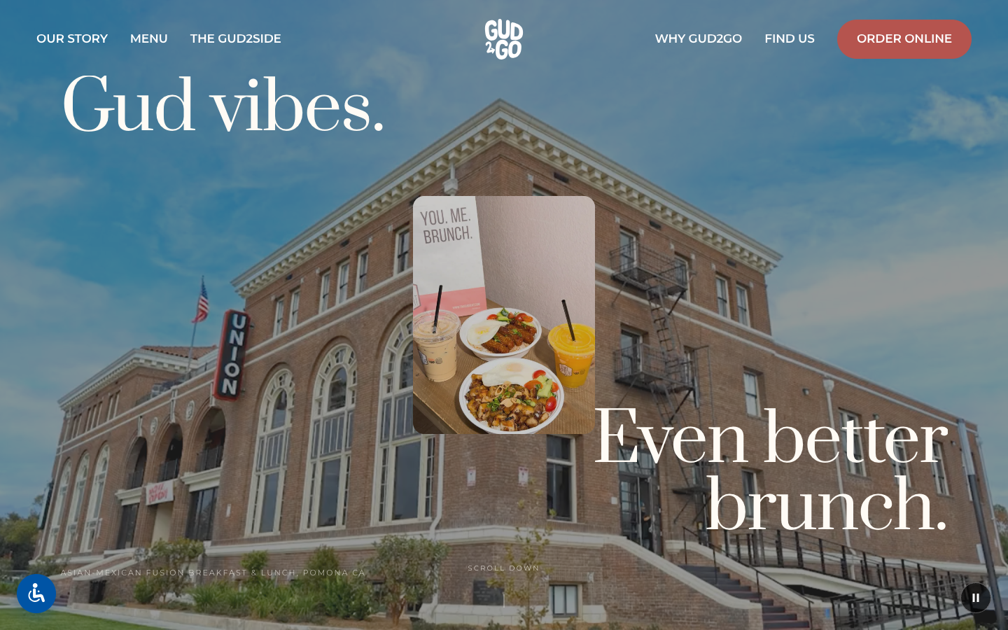
A homepage that knows its one job.
One screen, one decision, one obvious tap. That's the whole shape of the Gud2Go mobile homepage.
05
Ready for a website that runs at the pace of your line?
If you run a cafe, a takeout-first concept, or any grab-and-go business, the homepage's job isn't to impress. It's to get the next order moving. We build for that.
Start the conversationRelated reading
-
Online ordering vs. reservations on the homepage
When the primary call to action on your restaurant homepage should be "order" instead of "book a table."
-
Why your restaurant's menu shouldn't be a PDF
PDF menus break on mobile, hide from search, and slow down the one decision a hungry visitor wants to make.